Variance
6 min read•november 23, 2021
William
William
Statistical Variance
Hello, and welcome, statisticians! If you’re familiar with the standard deviation of a data set, then finding the statistical variance is yet another interpretation. Whether you’re here to get another step closer to becoming a statistician or you’re preparing for a big test, this guide will provide you with everything you need to know about statistical variance. 💪
Let’s get started! 🚀
Defining Variance
Variance is a measure of data distribution and helps statisticians discover several additional details about the data as a whole. 🌋
Statisticians typically like to use r^2 to define the variance as a variable. While graphing calculators might only provide the value r, squaring that value will give you the variance value. Let’s explore this idea a little further by putting it into the context of data and relationships with other concepts! 🎉
Introducing the LSRL
The LSRL stands for the least standard regression line, and it is the linear “line of best fit” for a set of data.
You can typically find accurate variance used most with scatterplots and two-variable quantitative data.
A scatterplot is a type of graph that supports two-variable data, or data with two variables (ex. x-value: temperature, y-value: number of ice cream cones sold).
Quantitative data is data that can be counted or measured numerically.
Scatterplots offer exact data points that allow statisticians to find an LSRL and statistical variance.
With the LSRL, statisticians have an accurate visualization of the line of best fit that represents the data as a whole! Let’s transition to finding a relationship between the LSRL and variance to discover more information about interpreting variance with both r and the line of best fit! 🔍
Interpreting the LSRL
The LRSL is relatively easy to interpret. There are a couple of key features to be mindful of, and all of them involve identifying characteristics of the graph from a birds-eye view. In other words, you must be able to take all of the data from the graph as a whole! 🐦
Is the graph weak, moderate, or strong? You can typically identify this by looking at how closely the points “hug” a graph. You can say a graph is something in-between two descriptors, such as “moderately weak” or “moderately strong.” A graph could also be very weak or very strong! The exception is for a perfectly linear graph with a perfect association, whose descriptor would be “perfect”! 🤩
Is the graph linear or nonlinear? If the graph is linear, a straight line could pass through the points and fit them relatively well. On the contrary, a nonlinear graph would have a curve or another nonlinear shape. The equation of the LSRL may be linear, but it would not accurately associate with the contour of the graph.
Does the graph have a positive or negative association? In an Algebra 1 class, you may have learned that y = mx + b and discovered that a positive linear equation has increasing x and y-values; in contrast, a negative linear equation has a slope where the y-value decreases for every x value. That same concept applies here! Is there a general negative trend as the x-value increases, or does the y-value generally increase?
Combining Parts of an Interpretation as a Whole
Let's practice combining all of the different parts of an LSRL interpretation and translate that into a real-life problem. You can find an answer key at the bottom of the page. Be aware that your answer doesn't need to perfectly reflect the one shown at the bottom, but it should still have some key points!
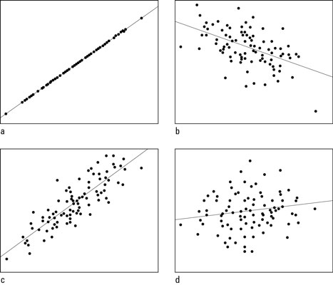
Image Courtesy of dummies.
Relating the LSRL with Variance
If we know that the LSRL reflects the line of best fit for a set of data, then what is the r value? We previously discovered that the r value is the strength of the graph, or how close the points "hug" to the graph. Let’s look at an example: if you were to translate the graph, so it was a horizontal line with all its points plotted, you could better identify the spread of the data. That’s essentially what an r value tells us! 🤯
Now, using r, we can capture the strength of the spread! R always needs to be between -1 and 1. Any value between -1 to 0 reflects a negative association, and 0 to +1 reflects a positive association in terms of the x and y-values. A value of 0 would mean there is no correlation.
By squaring the r value, we can determine how much of the association can describe the variability. Since the residuals, or the distance between the LSRL and each point, is different (at least in most scatterplots), we can use r^2 to show the percentage of the points can be described by the strength of the graph! 💪
Possible Answers: Practice Questions
There is a very strong, positive, linear association between the x and the y-values. Did you use “near perfect” to describe the graph’s strength? Did you use "near-perfect" to describe the graph's strength? Using the term "near-perfect" is appropriate yet not ideal when interpreting graphs. There are many different interpretations of "near-perfect," so sticking to "very strong" would be better.
There is a moderate, negative, linear association between the x and the y values. If you described the association as “moderately weak”, that would still be a fairly accurate description.
There is a moderately strong, positive, linear association between the x and the y-values.
There is a weak, positive, linear association between the x and the y values. Many of the points lie far from the LSRL, so the association between the x and y values is weak. As for the linear association, it is still linear rather than nonlinear because the distance between the points and the LSRL is still fairly equidistant, and there is no sign of a clearly defined curve in the graph.
What to Take Away
We hope you discovered something new in this lesson related to variance. We can use the LSRL and r, particularly with scatterplots, to find and interpret the overall spread of the data. The LSRL captures the line of best fit over the entirety of the data, whereas the r value captures the strength of the spread. With that said, good luck with your studies, and see you next time! 🌊
🤝Connect with other students studying statistics and variance with Hours.
Variance
6 min read•november 23, 2021
William
William
Statistical Variance
Hello, and welcome, statisticians! If you’re familiar with the standard deviation of a data set, then finding the statistical variance is yet another interpretation. Whether you’re here to get another step closer to becoming a statistician or you’re preparing for a big test, this guide will provide you with everything you need to know about statistical variance. 💪
Let’s get started! 🚀
Defining Variance
Variance is a measure of data distribution and helps statisticians discover several additional details about the data as a whole. 🌋
Statisticians typically like to use r^2 to define the variance as a variable. While graphing calculators might only provide the value r, squaring that value will give you the variance value. Let’s explore this idea a little further by putting it into the context of data and relationships with other concepts! 🎉
Introducing the LSRL
The LSRL stands for the least standard regression line, and it is the linear “line of best fit” for a set of data.
You can typically find accurate variance used most with scatterplots and two-variable quantitative data.
A scatterplot is a type of graph that supports two-variable data, or data with two variables (ex. x-value: temperature, y-value: number of ice cream cones sold).
Quantitative data is data that can be counted or measured numerically.
Scatterplots offer exact data points that allow statisticians to find an LSRL and statistical variance.
With the LSRL, statisticians have an accurate visualization of the line of best fit that represents the data as a whole! Let’s transition to finding a relationship between the LSRL and variance to discover more information about interpreting variance with both r and the line of best fit! 🔍
Interpreting the LSRL
The LRSL is relatively easy to interpret. There are a couple of key features to be mindful of, and all of them involve identifying characteristics of the graph from a birds-eye view. In other words, you must be able to take all of the data from the graph as a whole! 🐦
Is the graph weak, moderate, or strong? You can typically identify this by looking at how closely the points “hug” a graph. You can say a graph is something in-between two descriptors, such as “moderately weak” or “moderately strong.” A graph could also be very weak or very strong! The exception is for a perfectly linear graph with a perfect association, whose descriptor would be “perfect”! 🤩
Is the graph linear or nonlinear? If the graph is linear, a straight line could pass through the points and fit them relatively well. On the contrary, a nonlinear graph would have a curve or another nonlinear shape. The equation of the LSRL may be linear, but it would not accurately associate with the contour of the graph.
Does the graph have a positive or negative association? In an Algebra 1 class, you may have learned that y = mx + b and discovered that a positive linear equation has increasing x and y-values; in contrast, a negative linear equation has a slope where the y-value decreases for every x value. That same concept applies here! Is there a general negative trend as the x-value increases, or does the y-value generally increase?
Combining Parts of an Interpretation as a Whole
Let's practice combining all of the different parts of an LSRL interpretation and translate that into a real-life problem. You can find an answer key at the bottom of the page. Be aware that your answer doesn't need to perfectly reflect the one shown at the bottom, but it should still have some key points!
Image Courtesy of dummies.
Relating the LSRL with Variance
If we know that the LSRL reflects the line of best fit for a set of data, then what is the r value? We previously discovered that the r value is the strength of the graph, or how close the points "hug" to the graph. Let’s look at an example: if you were to translate the graph, so it was a horizontal line with all its points plotted, you could better identify the spread of the data. That’s essentially what an r value tells us! 🤯
Now, using r, we can capture the strength of the spread! R always needs to be between -1 and 1. Any value between -1 to 0 reflects a negative association, and 0 to +1 reflects a positive association in terms of the x and y-values. A value of 0 would mean there is no correlation.
By squaring the r value, we can determine how much of the association can describe the variability. Since the residuals, or the distance between the LSRL and each point, is different (at least in most scatterplots), we can use r^2 to show the percentage of the points can be described by the strength of the graph! 💪
Possible Answers: Practice Questions
There is a very strong, positive, linear association between the x and the y-values. Did you use “near perfect” to describe the graph’s strength? Did you use "near-perfect" to describe the graph's strength? Using the term "near-perfect" is appropriate yet not ideal when interpreting graphs. There are many different interpretations of "near-perfect," so sticking to "very strong" would be better.
There is a moderate, negative, linear association between the x and the y values. If you described the association as “moderately weak”, that would still be a fairly accurate description.
There is a moderately strong, positive, linear association between the x and the y-values.
There is a weak, positive, linear association between the x and the y values. Many of the points lie far from the LSRL, so the association between the x and y values is weak. As for the linear association, it is still linear rather than nonlinear because the distance between the points and the LSRL is still fairly equidistant, and there is no sign of a clearly defined curve in the graph.
What to Take Away
We hope you discovered something new in this lesson related to variance. We can use the LSRL and r, particularly with scatterplots, to find and interpret the overall spread of the data. The LSRL captures the line of best fit over the entirety of the data, whereas the r value captures the strength of the spread. With that said, good luck with your studies, and see you next time! 🌊
🤝Connect with other students studying statistics and variance with Hours.
Resources
© 2024 Fiveable Inc. All rights reserved.
AP® and SAT® are trademarks registered by the College Board, which is not affiliated with, and does not endorse this website.